Creative Caps On!
- neonraid94
- Apr 27, 2020
- 3 min read
Updated: May 23, 2020
We had an intermediate presentation where the past 3 posts were discussed with the Professor and teaching assistants. It was decided that we would focus on just one country - Belgium and the 3 cities in it. This is just for simplicity and an attempt to reduce complexity as each city has about 20 thousand rows and 106 variables each - when taking 41 cities, this just explodes and we may have bitten off more than we could chew. So, going forth, the plots will be solely for 3 cities - Antwerp, Brussels and Ghent.
This week we wanted to don our creativity caps and create some hand drawn sketches that help us explore the data

Figure 1: Type of Listing Vs. Number of properties
The channel used is building types. Each point is a sketch of the different types of properties available on the AirBnB site - Apartments, Hotels, Shared Rooms and Private Rooms. The size of the icon indicates the number of such properties that are available. For example, in the plot above, we can see that apartments are the most frequent while private rooms are the least occurring.
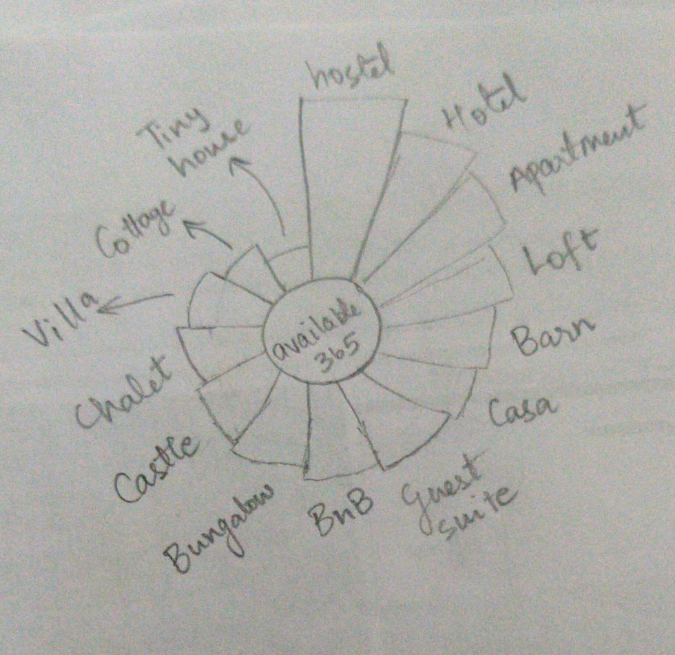
Figure 2: Availability in a year for different property types
Each property has a variable - availability_365 - which indicates how many days in a year they are available for booking. This isn't an idea that is very intuitive but makes sense. Hostels, Apartments and Hotels are available for almost the whole year - that might be due to the fact that the owners/ staff live and work nearby and can easily let the visitors in and help with cleaning or maintenance.
On the other hand, Villas, Chalets and Castles are available only for a few months. Villas and Ski Chalets will only have a high demand during the "ski season" and Castles will be very tiresome to clean all year around, given that the owners may not stay there.

Figure 3: Map view of density of type of rooms
We have already understood that certain neighborhoods will be more popular than others. But does that have a correlation with types of properties? This plot helps us see the type of room by colour in the map of the city. So, based on density we can understand the type of clientele their preferences.
For example, crowded neighborhoods like Grand Place in Brussels would only have a higher density of hostels or shared rooms, while areas like Churchill are more likely to have more apartments and houses.

Figure 4: Sketching the Balance between Price, Rating and Cancellation
The above graph shows the plot of the average price of the AirBnB with respect to the cancellation policy set by the host. This is to check if the strictness of the cancellation policy has anything to do with how expensive the place is. If in case the host is flexible with her cancellation policy and the price is really low and if the cancellation policy gets stricter as the price increases, we can make a possible conclusion that the more expensive the place is, the more amenities available and thus more the demand, thus stricter the cancellation policy. If the average price does not vary much beyond a certain strictness level(eg., strict 14), we can conclude that it makes no difference to the price if it gets stricter than that level. One more factor to consider in the plot is the size of the diamond that is used to denote the average price per strictness level. The size denotes the average rating score per strictness level. Whether the host being lenient is a factor for the guest to rate it higher or because the fact that they ended up staying in the place anyway did not affect the rating given by them.


Comments